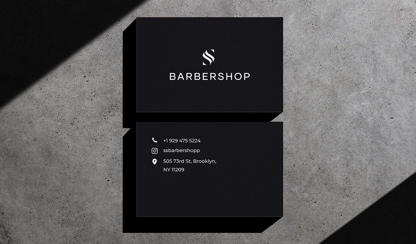
CLIENT
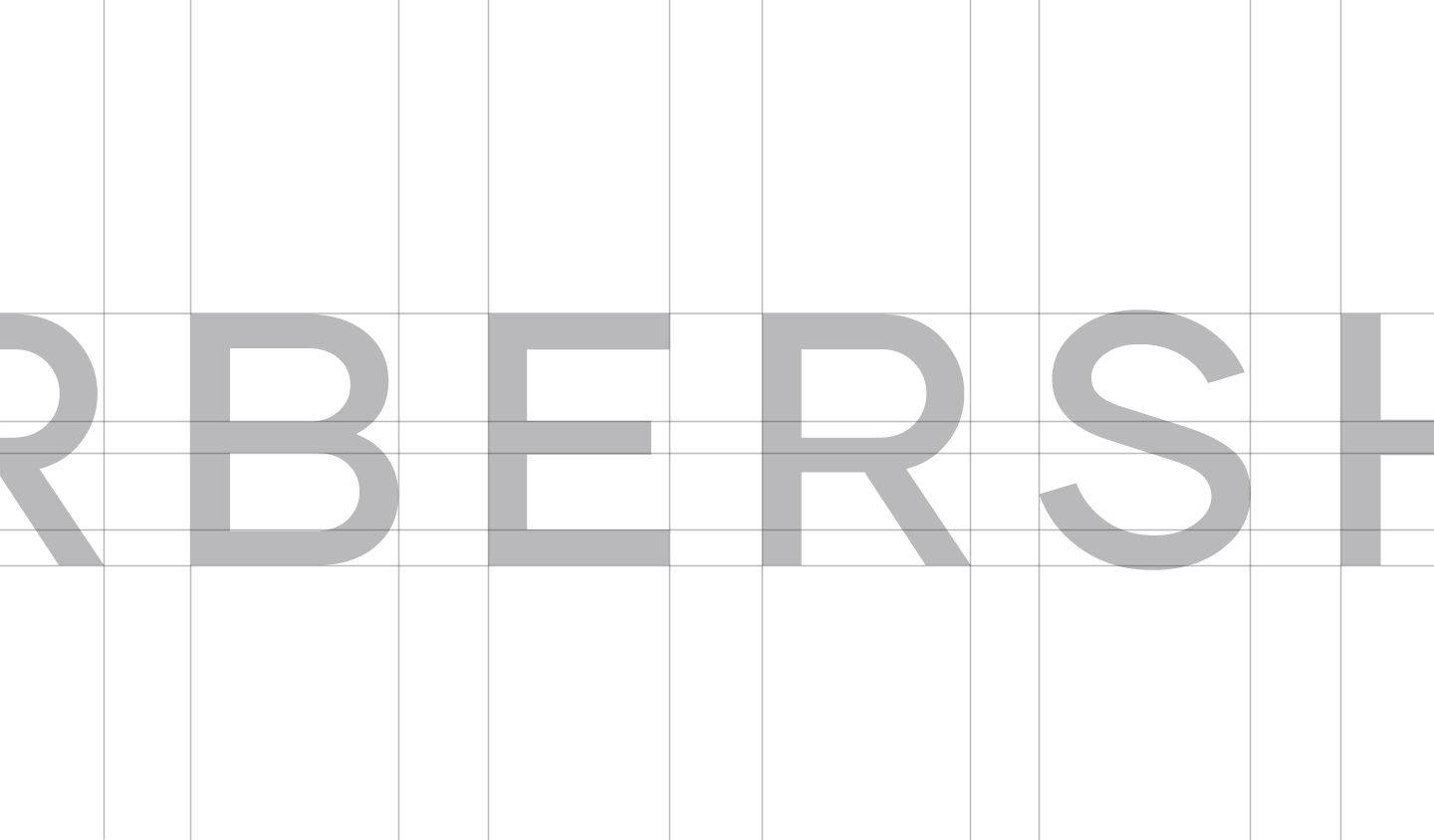
SS Barbershop
YEAR
2021
DISCIPLINES
Art Direction, Branding
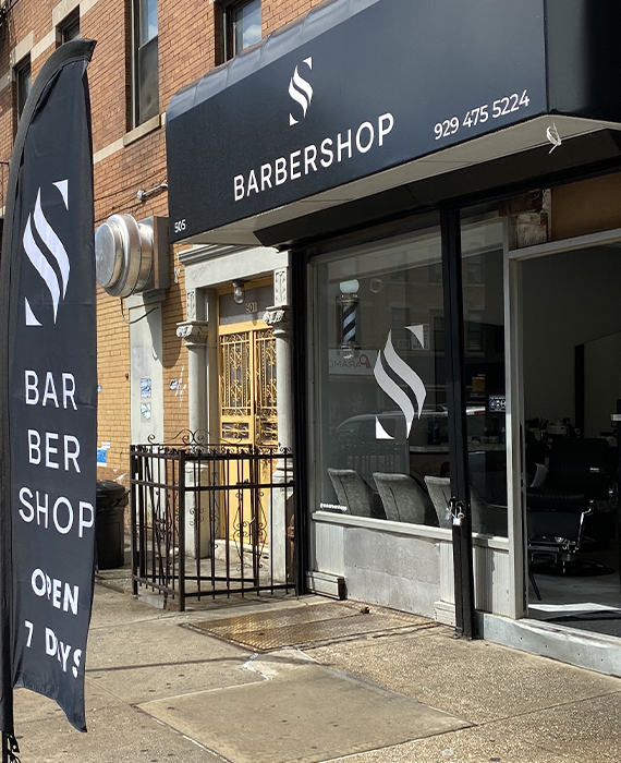
Based in Brooklyn, New York, SS Barbershop is run by a solopreneur who reached out to me online to solicit my branding services. Embarking on a new venture, the founder was opening his barbershop and required a luxury logo to match his vision of rendering quality men’s hair care services in Brooklyn.
DEVELOPMENT
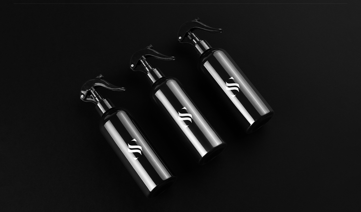
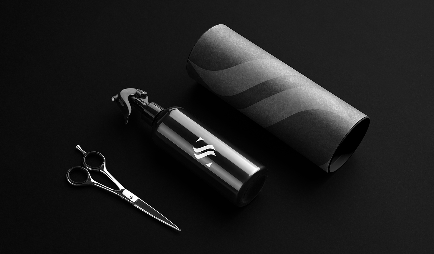
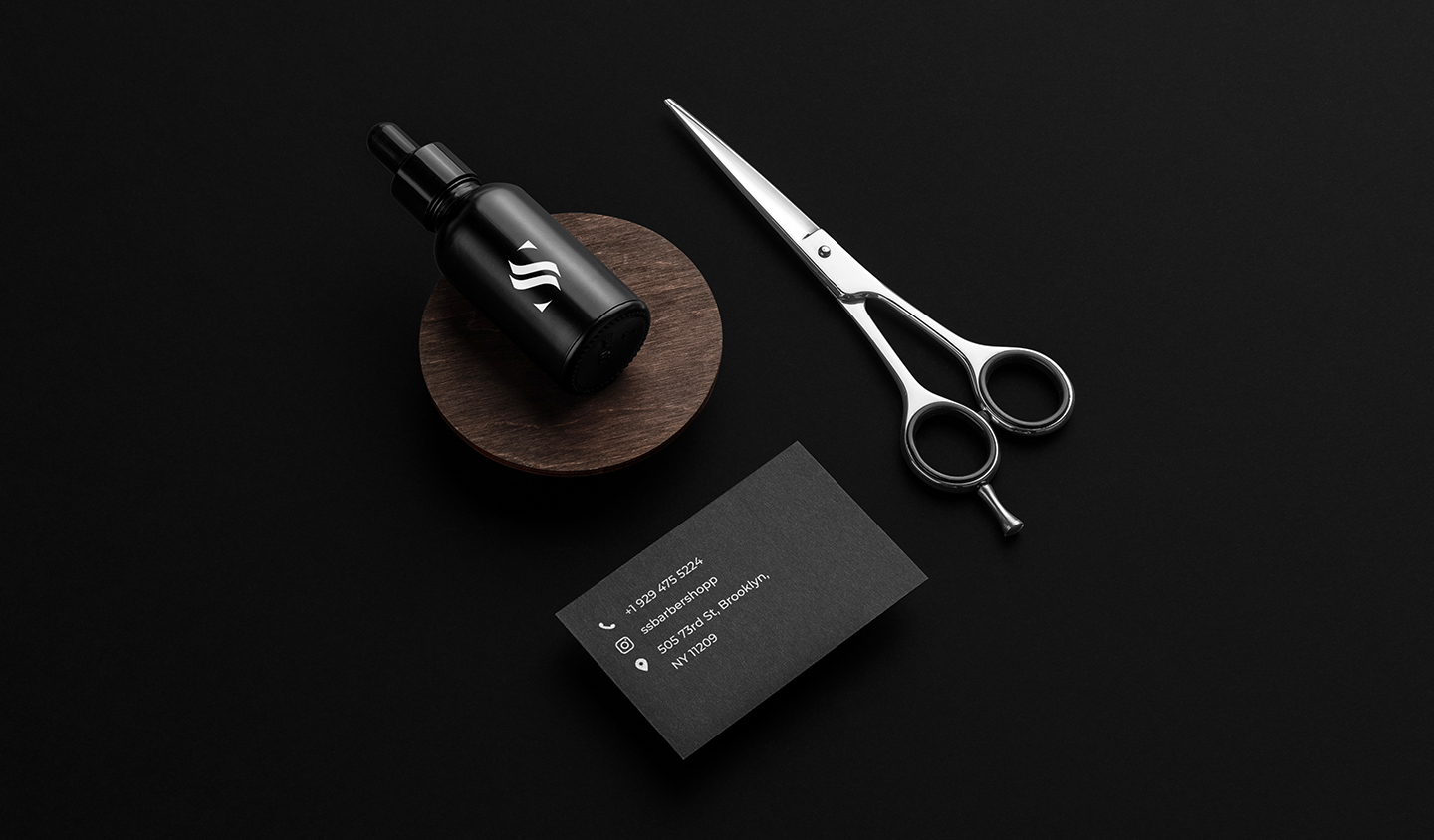
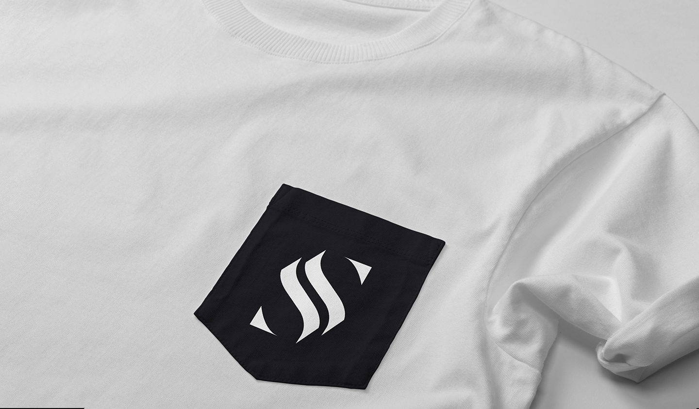
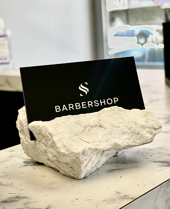
Since hair care services involve the usage of sharp items such as blades, I pondered over the shapes that I could create with sharp edges. Moreover, I wanted to emphasize the solo brand of the founder, which is why I added an SS in the monogram; SS being the initials of the founder. As such, I settled on adding the client’s initials and sharp edges that denote the usage of a blade in hair care services.
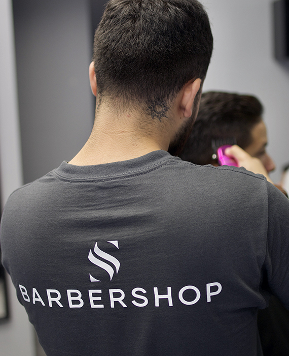
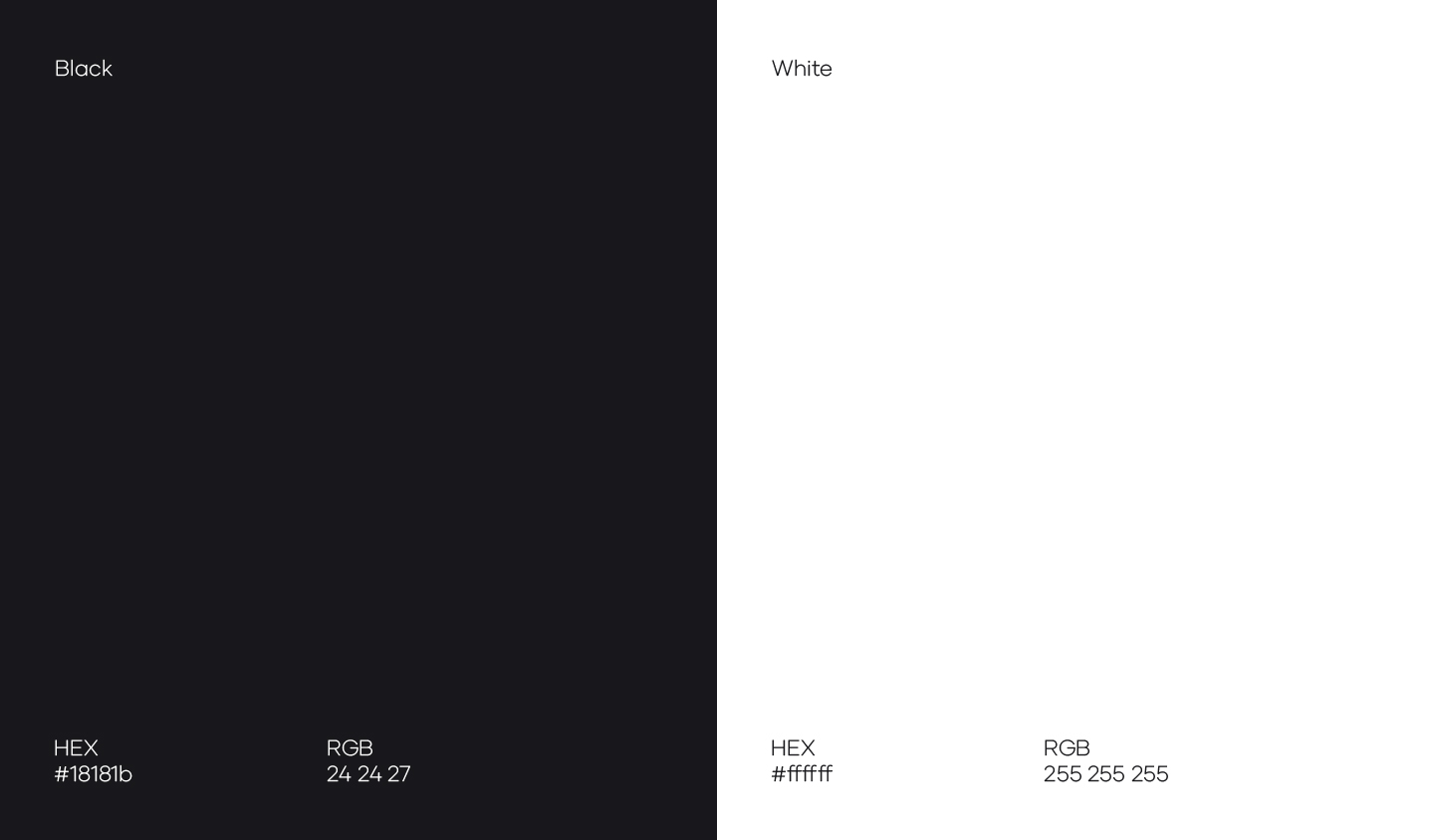
COLOR PALETTE
The client was straightforward about the color palette, i.e., monochrome. They wanted a combination of black and white to exude their luxury hair care services.
TYPOGRAPHY
As I had already used sharp edges in the logomark, in reference to blades, I considered it suitable to use a sans-serif font since they boast sharp edges too.
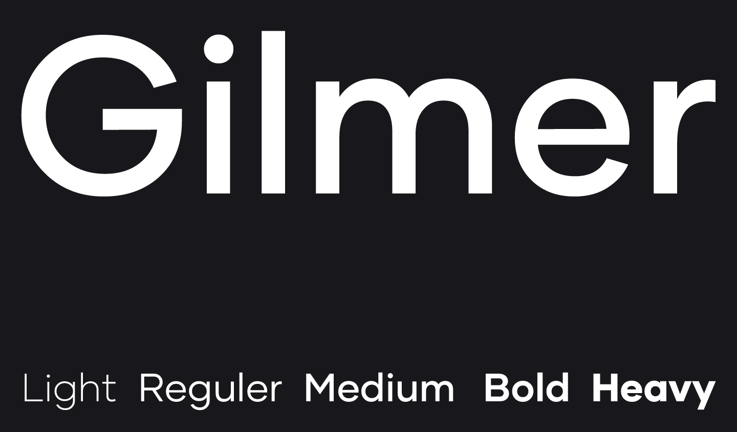
TYPOGRAPHY
Sofia Pro is a font that comes with a range of weights and styles, making it easy to adapt to various communication mediums. As such, I decided to choose this font for the typography of the logo.