CLIENT
SKNUP
YEAR
2020
DISCIPLINES
Art Direction, Branding
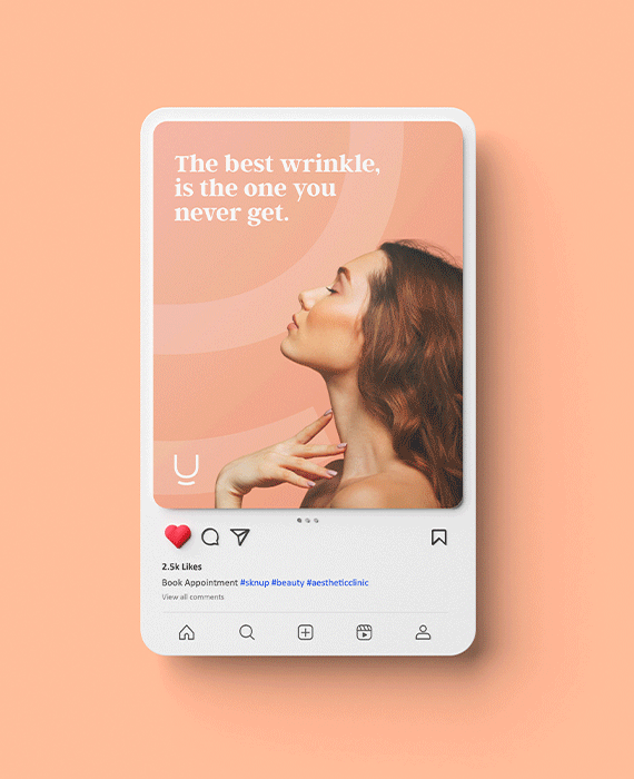
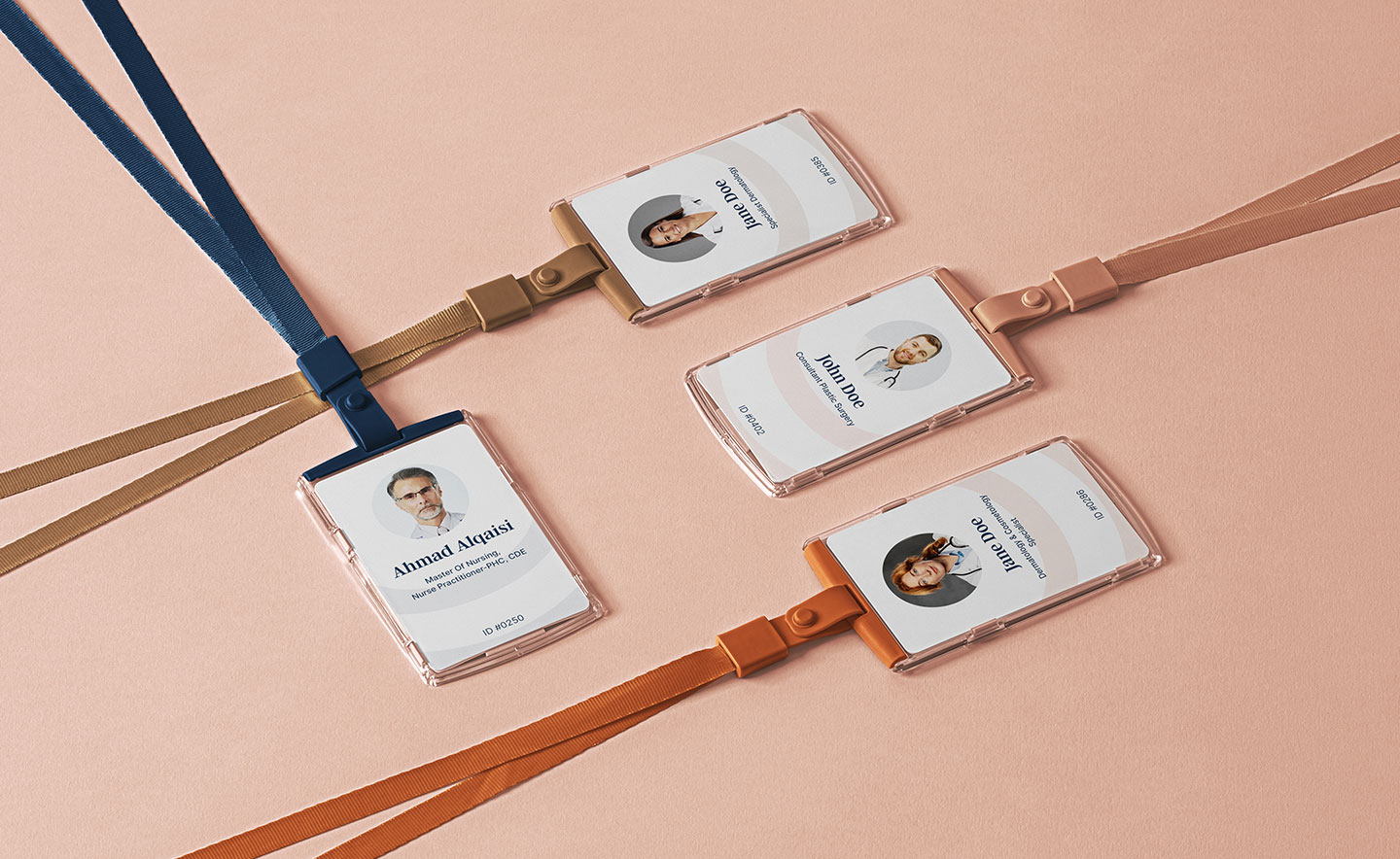
In 2020, SKNUP approached me to develop a brand identity that would deeply resonate with their values and mission. As a clinic committed to offering results-driven skin treatments with a personal touch, they sought a logo that would embody both the warmth and reliability of their services. My goal was to capture the clinic’s dedication to enhancing natural beauty while ensuring a welcoming and empowering experience for every client.
RESEARCH & PLANNING
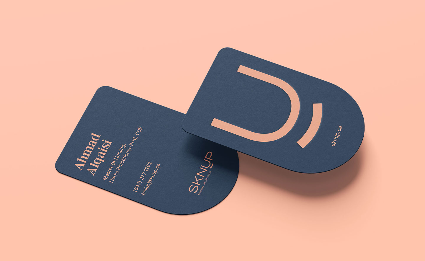
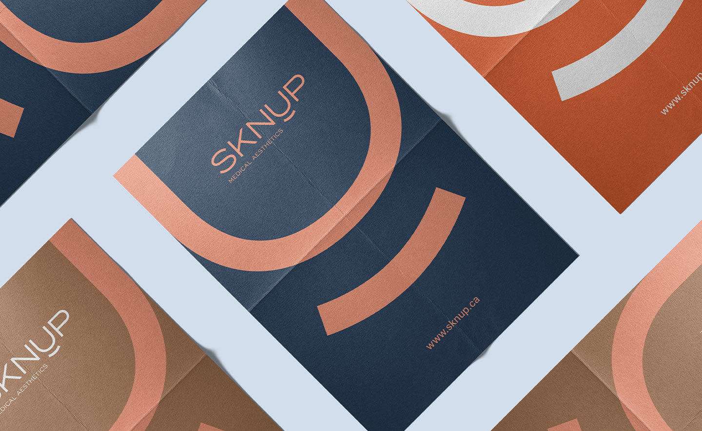
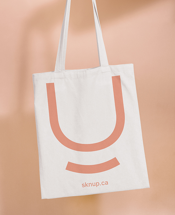
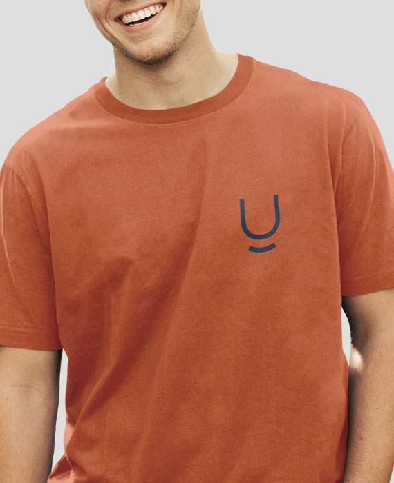
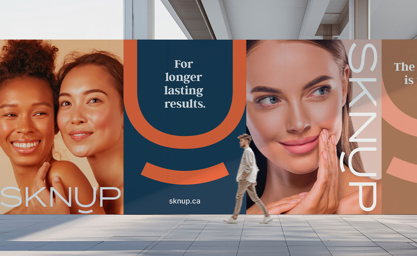
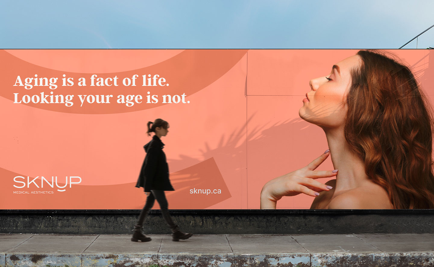
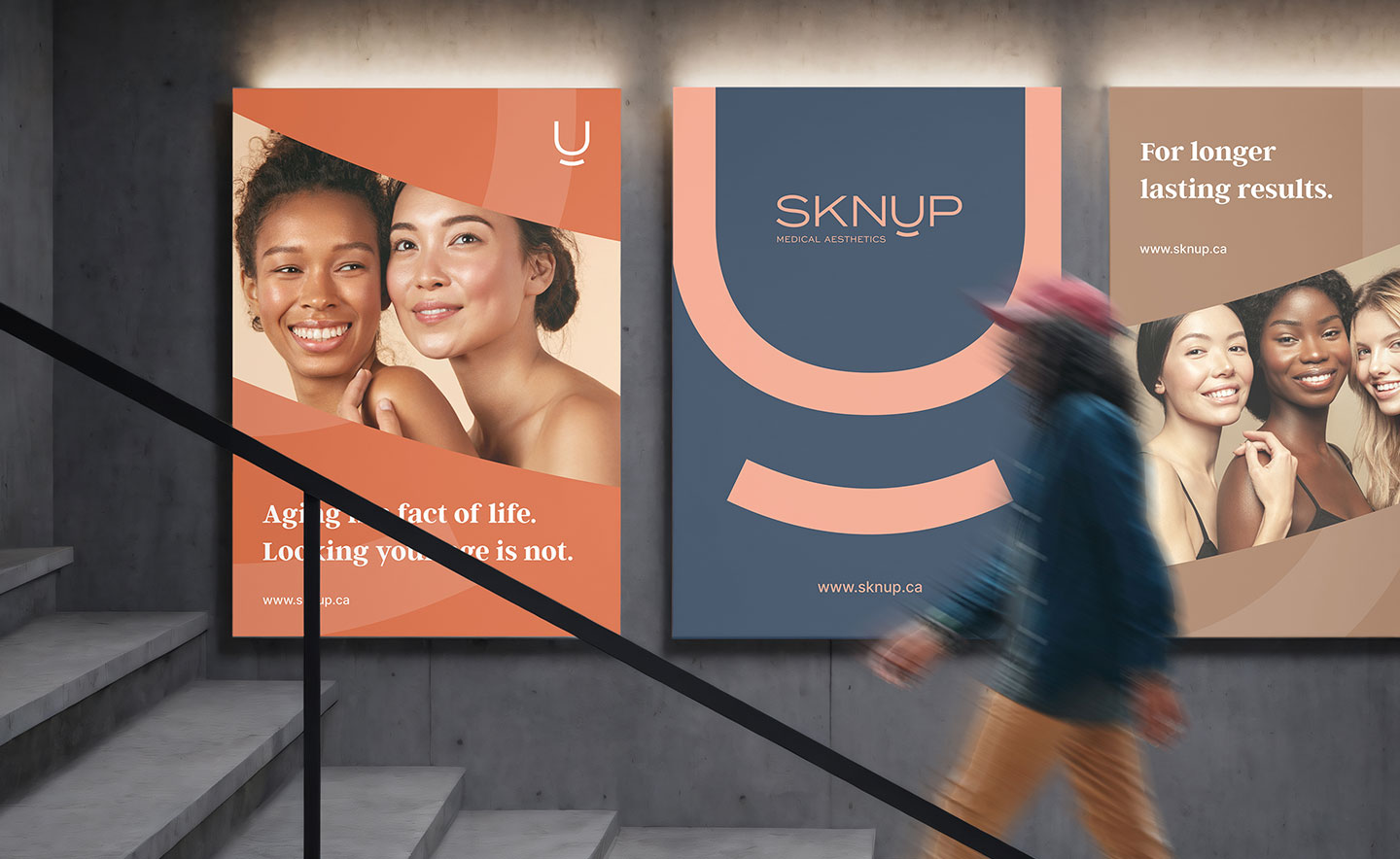
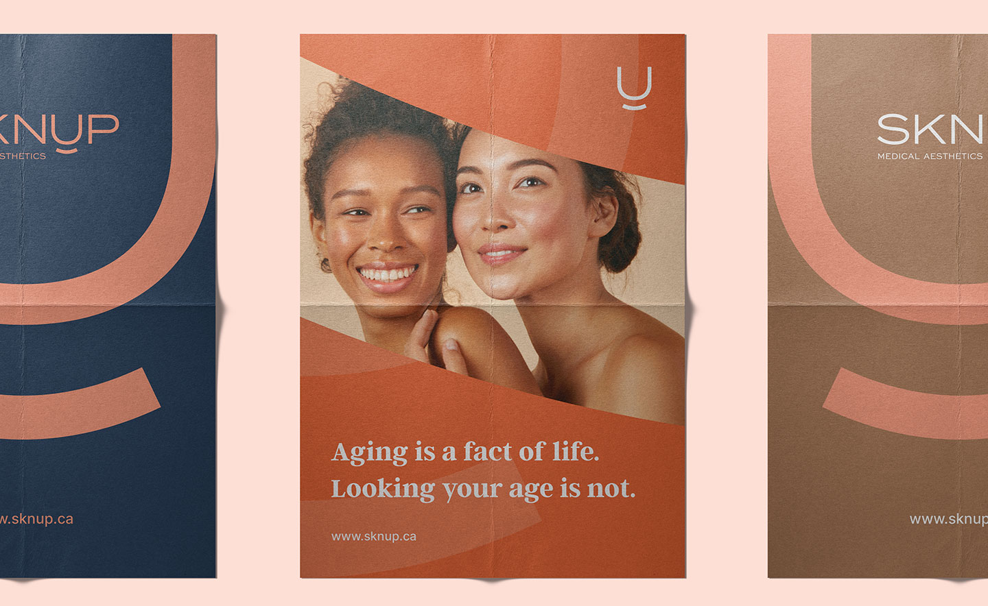
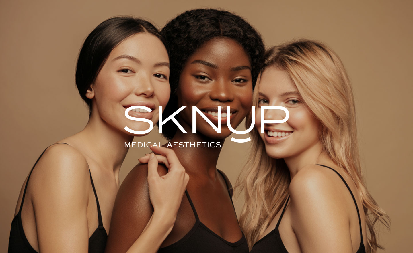
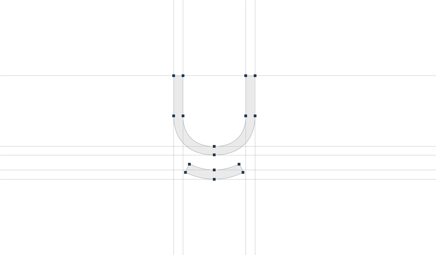
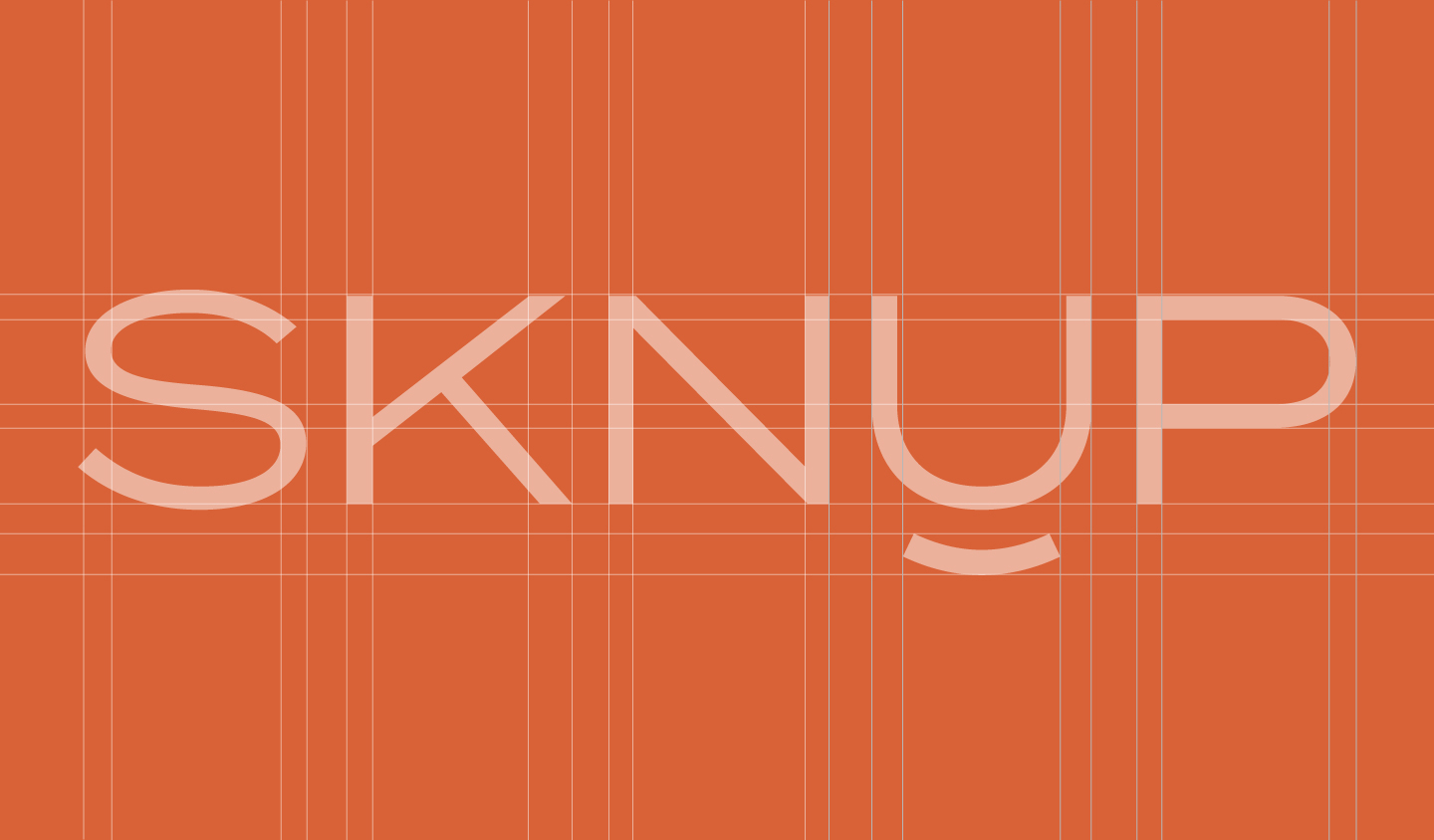
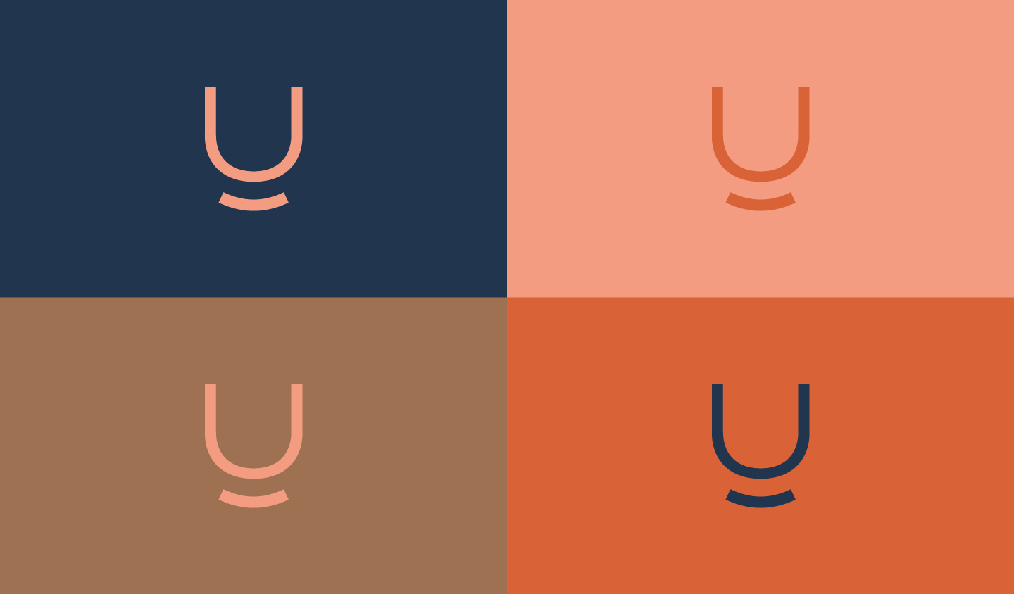
The concept stems from the idea that healthy and radiant skin brings an inner smile. The name was crafted by combining ‘SKN’ (representing skin) and ‘UP’ (signifying natural beauty alleviation). As a result, I designed a logotype that radiates confidence, along with a smile.
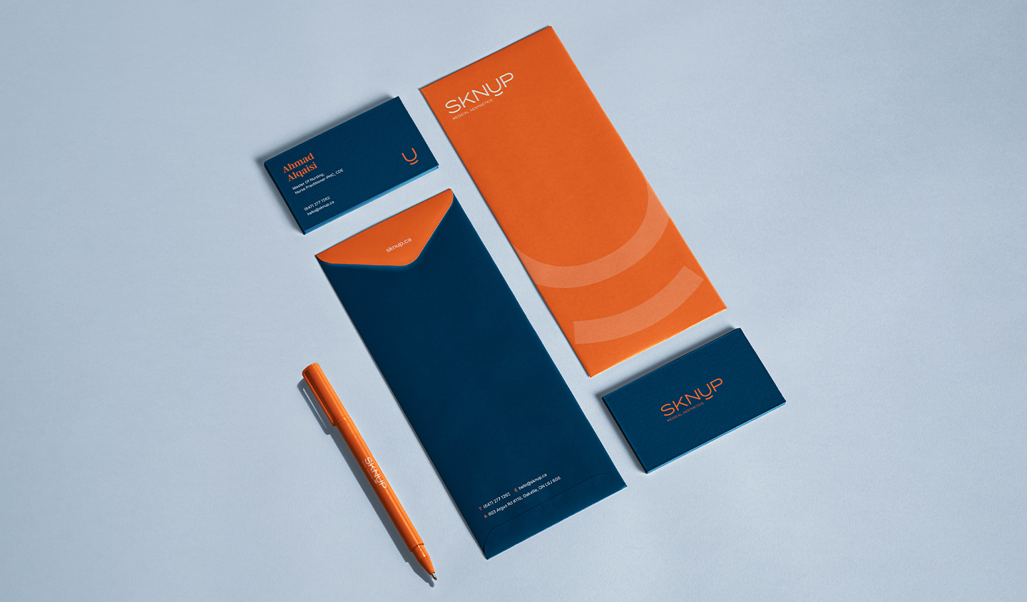
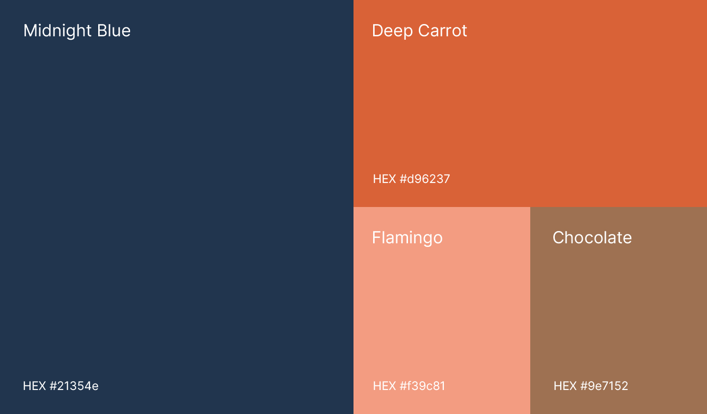
COLOR PALETTE
I chose Midnight Blue and Deep Carrot as the primary colors for their sophistication. Flamingo and Chocolate serve as secondary colors, evoking associations with skin tones and health. Overall, the palette exudes warmth and trustworthiness, aligning with the brand’s vision.
LOGOTYPE DEVELOPMENT
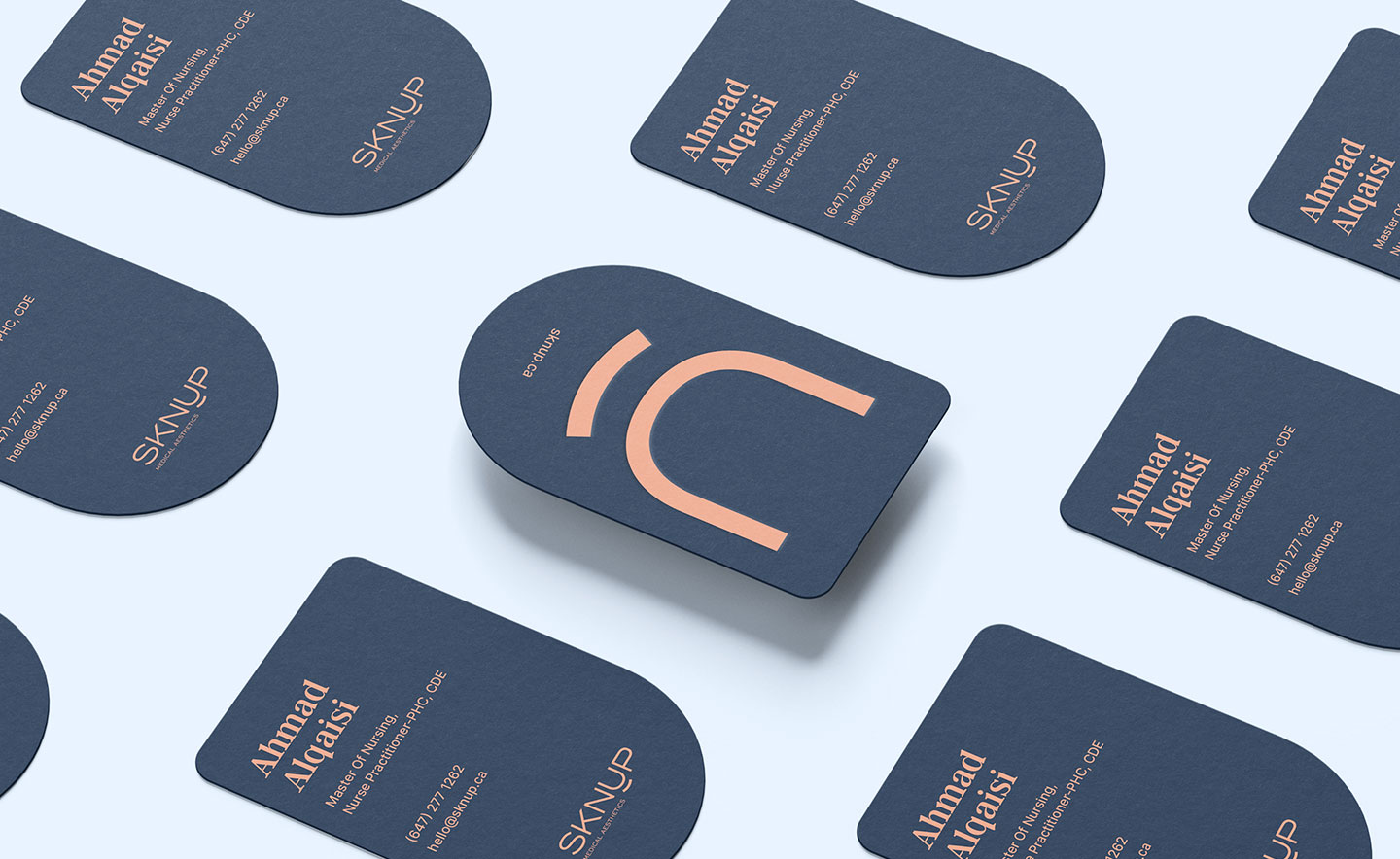
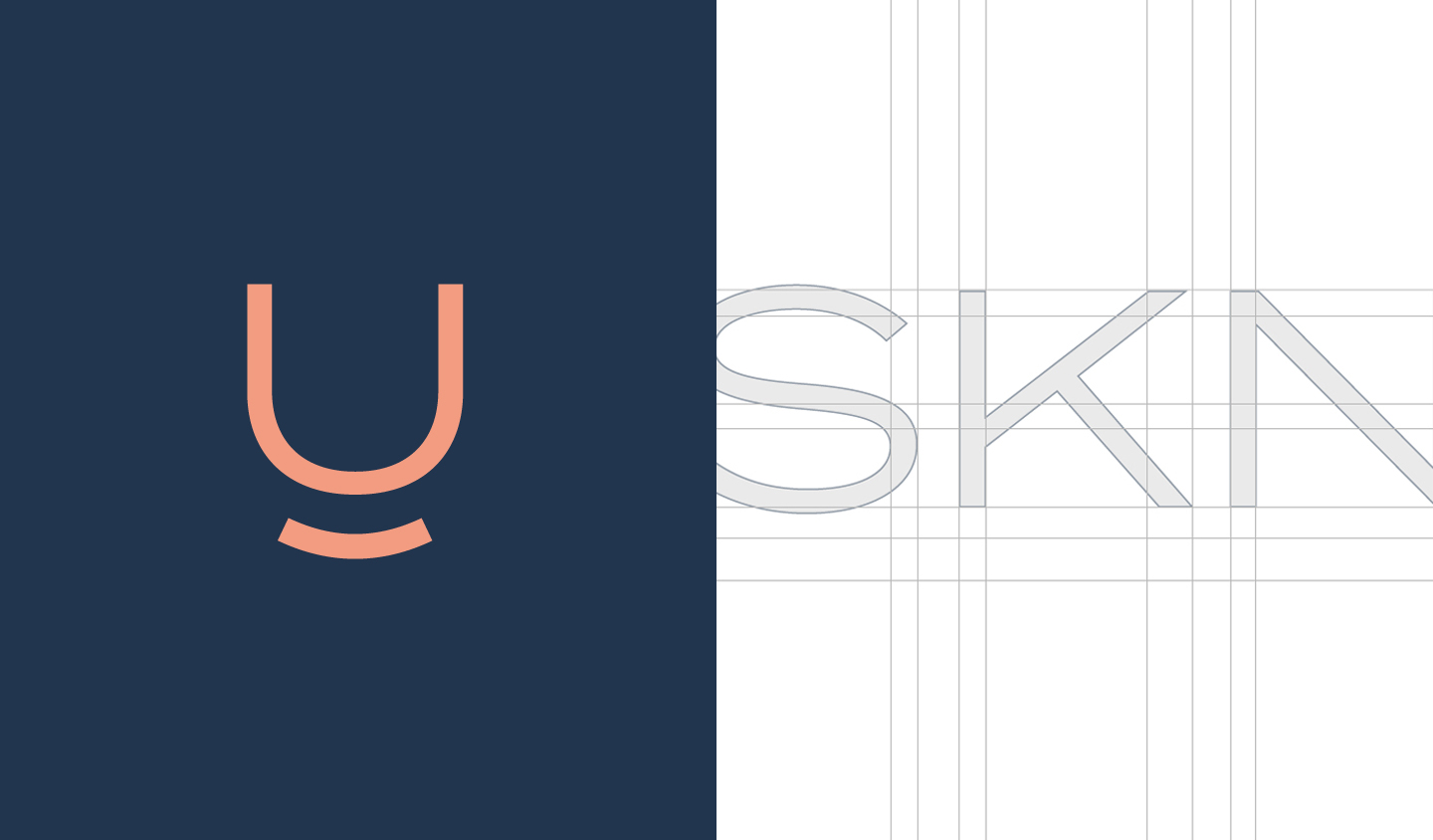
To harmonize with the smile beneath the ‘U’ I opted for a regular typeface weight. This ‘U’ symbolizes ‘YOU’ emphasizing the clinic’s client-centric nature and personalized treatments. The balance of professionalism and friendliness aligns perfectly with SKNUP’s core values.
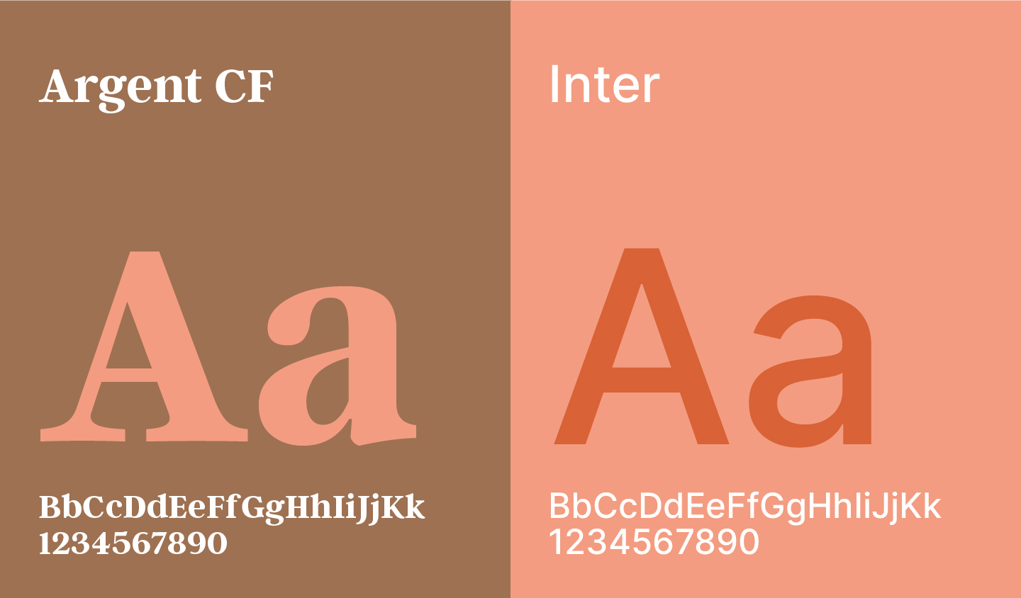
TYPOGRAPHY
I selected Argent CF for titles to achieve a distinctive look and chose Inter for body text due to its readability and versatility. This combination ensures clear, professional communication and enhances the overall brand presentation.