CLIENT
Hr Properties
YEAR
2019
DISCIPLINES
Art Direction, Brand Identity
The HR Group of Companies has been popular all across Pakistan, mostly for their catering brand namely Hanif Rajput. Upon contemplating the expansion of their business in the real estate sector and investment, in addition to their other hospitality services, they got in touch with me so I could craft a new brand identity for them.
RESEARCH & PLANNING
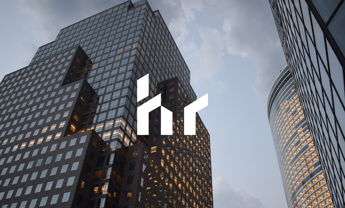
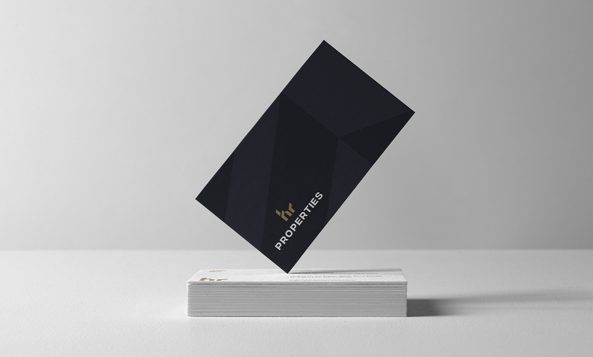
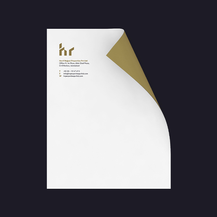
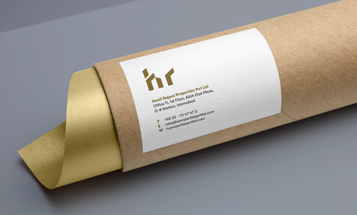
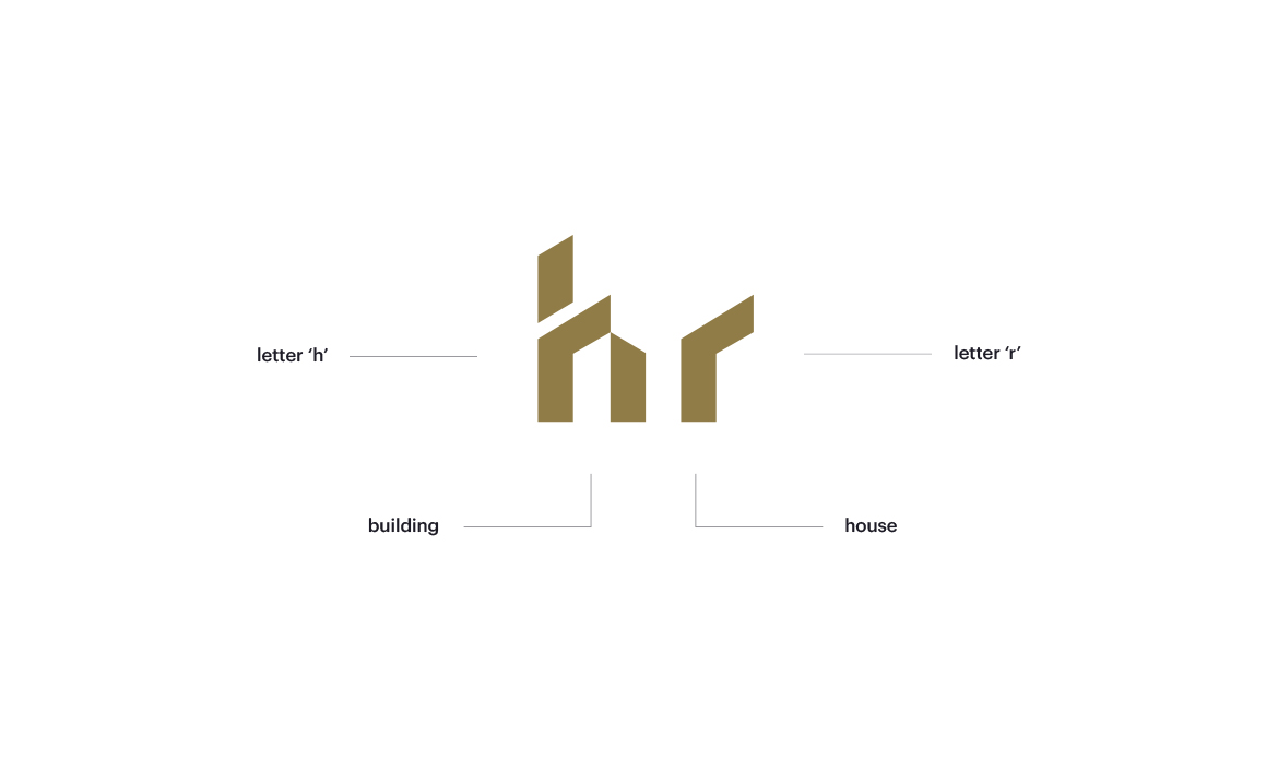
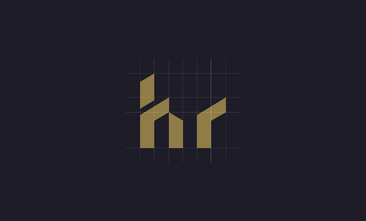
Since the business is focusing on real estate, I researched and visualised for all the elements that could be used in developing the brand. Concerning real estate, one can immediately think about houses and buildings while the business’s initials are H and R. Combining these elements; I came up with the shape of the logo.
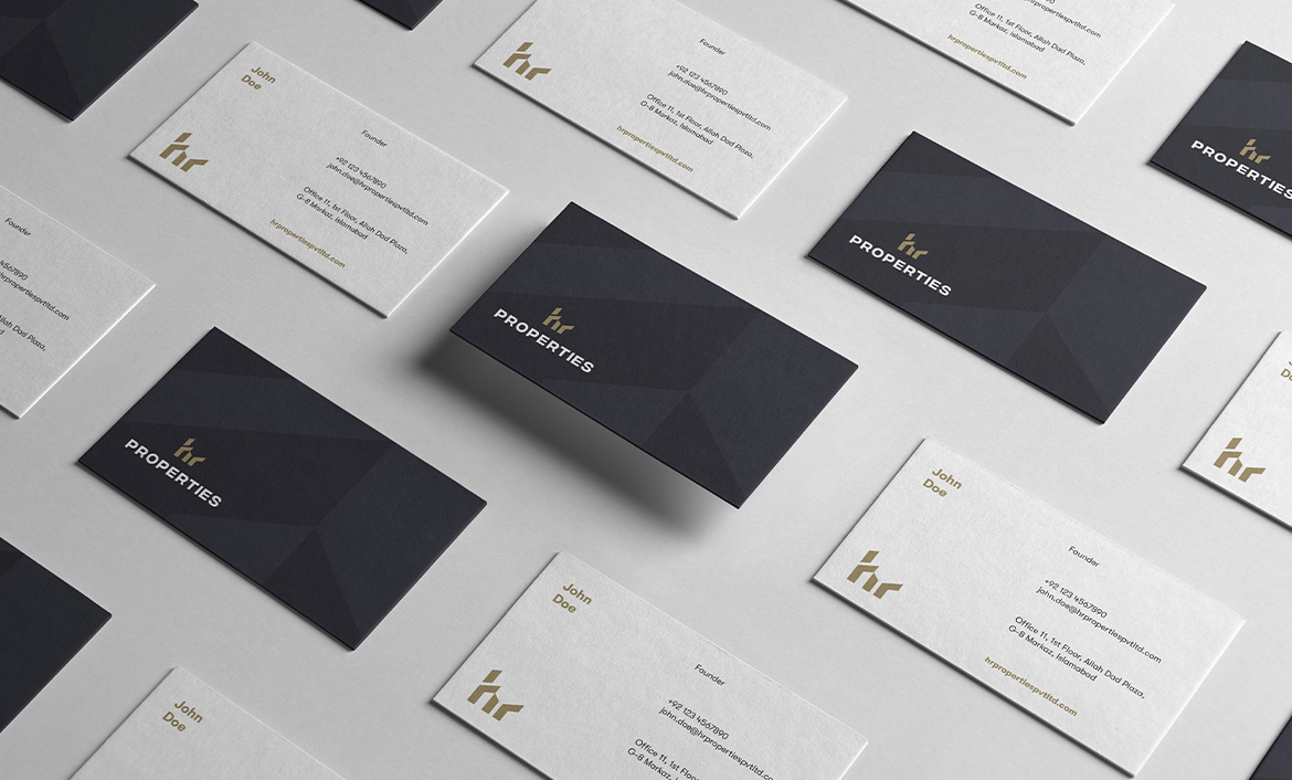
Next, I researched for the colour palette so I could choose the most relevant colours for the brand. Considering that the company has a high-end clientele and their target audience concerns the chic class of the society, I settled with a shade between golden and brown that appeared as premium high-end colours.
DESIGN & DEVELOPMENT
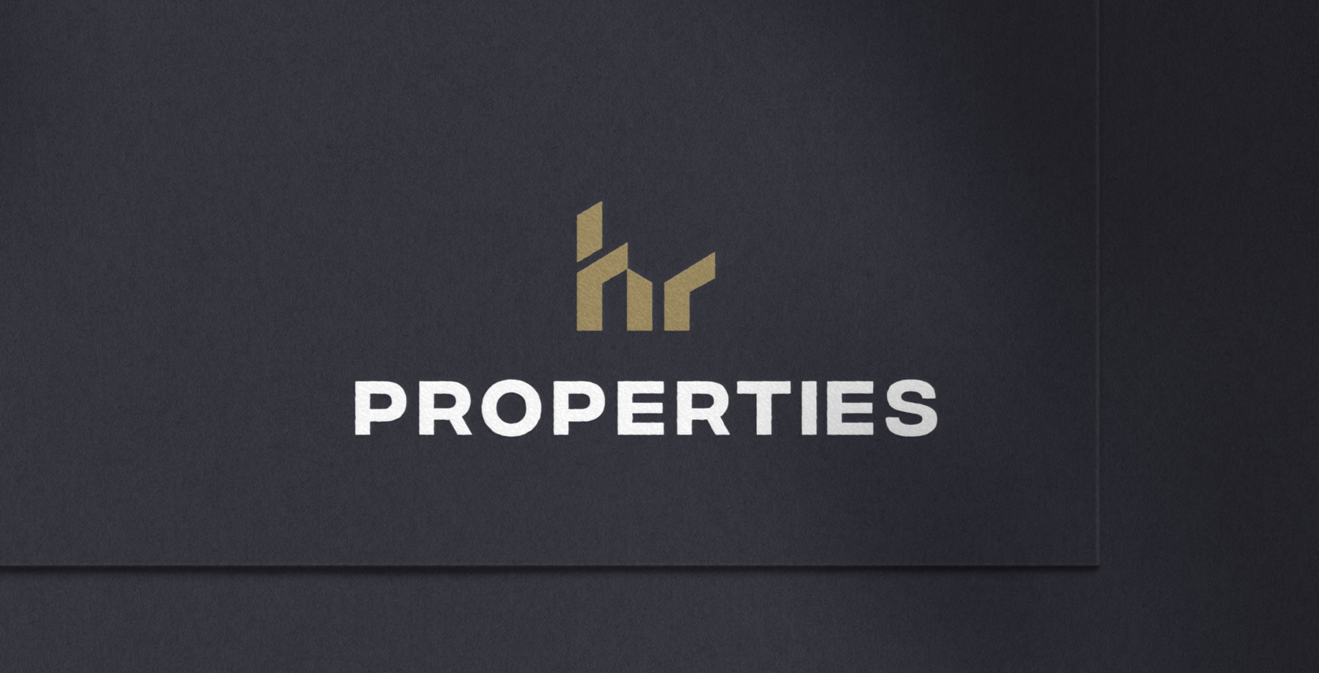
Now that I had created the main identity, it was time to add the ‘PROPERTIES‘ along with it, so that one could immediately identify that the brand was related to real estate. By customizing font, I wrote ‘PROPERTIES’ in uppercase letters as it exuded an aura of sobriety, as opposed to lowercase letters.
Hanif Rajput aimed on capturing the attention of potential investors who were enthusiastic about participating. Therefore, it was necessary to ensure that the logo appeared sophisticated enough to intrigue the target audience while being specific enough.
